How to Design & Decorate with Pantone’s Color of the Year
How to Design & Decorate with Pantone’s Color of the Year The announcement of Pantone’s color of the year choice creates a new color craze for designers and washes the old colors away for a fresh slate for the New Year. After all a new year deserves a new color, right?
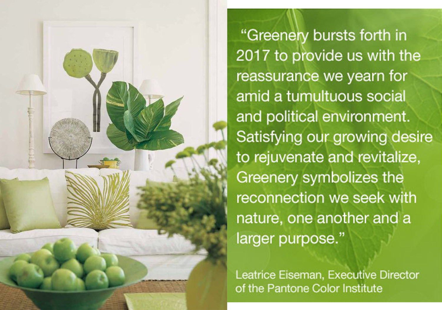
There may have been a sense of panic or disbelief this year when the choice color was publicized. The name of the 2017 Color of the Year speaks for itself, Greenery. Oh wow, green? Yes we are talking a yellowish green color that evokes the first day of spring. Greenery is such a color that matches that of a fresh leaf on the stem of a flower reaching towards the sun. Never has there been such a green of this shade to make it into the leading for color of the year, let alone be picked as 2017 Color of the Year.
In years prior Emerald and Turquoise were shades in the spot light, ones that were more subtle than were bold. This year, Greenery will take center stage.
Greenery is the color that stands for refreshment, rebirth, rejuvenation and a re-connection. This is what the world seems to need this New Year with the turn of a new president and life changes, or so the color world seemed to think for us. Now that we are past the shock factor of such a color for 2017, let’s talk about how to use this in your home and remodel design – without looking tacky.
Don't feel pressured to paint your whole house Greenery, be all means there are ways to incorporate the color without going that far- unless you want to.
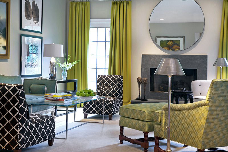
Add pops of Pantone's Color of the Year by switching out your old curtains, or throw pillows with ones of Greenery.
Paint the back of your book case Greenery, or opt for a non permanent choice by using a shade of Greenery contact paper to line the back.
There is nothing wrong with using the bold green as an accent, versus a center focus.
For more ways to design and decorate, check back for more blog issues.


